What to wear for a photo session in Spain: complete guide
Color palette, textures, what to avoid, and combinations that work in any season. Applies to couples, families, and individual portraits.
The most common question we get before every session is: "What do we wear?" Good news: there are universal rules that work in 95% of cases. This guide sums up everything we would tell you in your pre-session call: palettes that always work, typical mistakes to avoid, recommendations by season, and specific tips for couples, families, and maternity. Read once and you will never reopen your closet ten times before a session again.
Rule 1: neutral colors and earth tones
Beige, cream, olive, terracotta, light brown, off-white. These colors harmonize with warm Mediterranean light and almost any background: historic stone, sea, vegetation, or white wall. They work in any city, in any season, and for any age.
Avoid saturated reds, neon oranges, very bright greens, and intense purples. These colors "bleed" on camera (the sensor exaggerates intensity) and steal attention from the face. The viewer looks at the red shirt before your face, and that is not what we want in a portrait.
If you have fair skin, camel, mustard, and olive green tones flatter a lot. If you have darker skin, off-whites, creams, and soft khakis create beautiful contrast. Medium gray works on any skin tone.
Rule 2: texture, not patterns
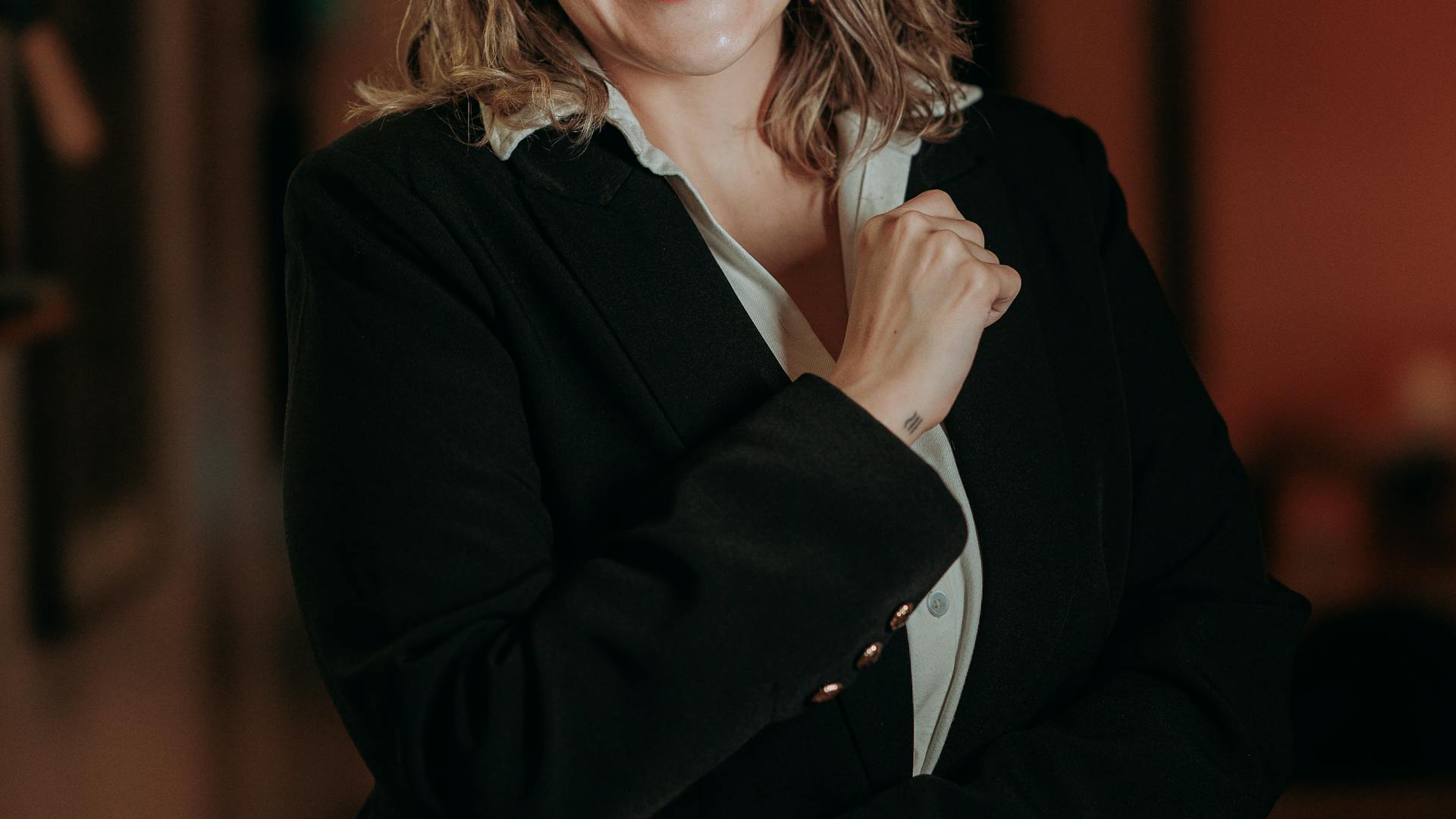
Linen, thick cotton, knit, corduroy, and handmade fabrics photograph beautifully. They add depth and character without distraction. A chunky knit sweater in stone color can turn a photo from "normal" to "editorial".
Small patterns (thin stripes, tiny dots, micro-checks) cause moiré (visual interference with the camera sensor). Photos appear to vibrate or have color lines where they should not. If you want a pattern, pick a large organic one (Liberty-style florals, broad geometry, wide stripes).
Combining textures in the same photo adds visual richness: linen over denim, wool over leather, silk over cotton. This is what separates editorial photos from catalog photos.
Rule 3: coordinate, do not match
For couples and families, choose a palette of 3 colors and let each person wear 1-2 of them in different combinations. Dressing everyone in matching white looks flat and "1990s school portrait".
A palette that always works: off-white + khaki + light denim. Works on the coast, in the city, and in the countryside, all year round. Another safe palette: terracotta + cream + olive green, perfect for autumn.
For sessions with young kids, avoid brand-new unworn clothes. Kids move more naturally in comfortable, familiar clothes. If you want a special look, let them play in it at home the day before.
Recommendations by season
Summer (May-September): flowing linen dresses, open white shirts, straw hats, nice sandals. Avoid absolute black — it reflects heat and sweaty skin causes glare on camera. Long dresses with side slits create spectacular movement in couple photos at sunset.
Fall (October-November): fine wool sweaters, long camel coats, leather boots. Autumn golden light pairs perfectly with browns, terracottas, and muted reds (not saturated reds). Probably the best season visually.
Winter (December-February): layers. Jacket over sweater over shirt = visual depth and options for photos with and without coat. A long stone-colored cashmere scarf adds volume and elegance. If shooting outdoors in cold, wear clothes that actually keep you warm, or you will be miserable.
Spring (March-April): soft pastel tones, light jeans, fine sweaters, lightweight blazers. The easiest season because any palette works. Blooming flowers create a spectacular natural background.
For couples: the inverted mirror trick
Instead of dressing matching, dress in complementary inverted style. If she wears a light beige dress, he wears light beige pants but with a white or dark blue shirt. If he wears a brown leather jacket, she wears a bag or boots in the same tone but the rest is light.
The goal: a single color or texture detail visually connects both bodies without looking uniform. This creates photos that feel natural and modern, not "studio-prepared".
For pre-ceremony or pre-wedding photos, consider two looks: one elegant casual (nice jeans + linen shirt) and one more formal (midi dress + jacket). Covers two use styles for invitations and social media.
For maternity and babies
Maternity: long flowing dresses in neutral colors, without excessive top neckline to keep attention on the belly. Fabrics like gauze, silk, and linen drape very photogenically. Favorite colors are cream, beige, and soft terracotta.
If you want intimate "fine art" photos, consider a long sheer dress over nude underwear. The resulting photos are artistic and timeless without being vulgar.
Newborns: knit blankets in earth tones, small organic cotton hats, natural cotton bodysuits. Avoid clothes with cartoon characters, slogans, or very bright colors. Newborn photos should be timeless.
Typical mistakes to avoid
Brand-new clothes with visible tags, iron marks, sharp folds. Iron and air your clothes the day before. Bring a lint roller in your bag.
Bright white sneakers with elegant clothes. Either pick an integral casual look or an integral elegant look — the mix looks weird.
Big flashy jewelry that reflects flash or steals attention. For a session, less is always more. A fine pendant, discreet rings, small earrings.
Makeup very different from your daily one. The camera catches every detail: if you do not usually wear much makeup, do not put it on for the session. Your partner will recognize you better in the photos and you will look more natural.